In 2021, I came across a Twitter account blowing up called @visualizevalue which posts minimal black-and-white images visualising a business concept, life philosophy or quote.
The creator of this account spent many years in the advertising industry.
Looking to learn the secret sauce, I decided to take their course.
Here are 3 high-level takeaways I still carry to this day.
#1: Pictures speak a thousand words
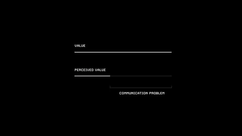
For artifacts intended to convey information (websites, presentations, ads), imagery helps to:
- Make certain explanations clearer
- Reduce visual clutter
- Emphasise the impact of a proposal or piece of data
- Tell an overarching story
Commonly in my experience working with others, diagrams are far more effective at capturing attention and conveying concepts than walls of text.
#2: Use known visual patterns
This is equivalent to how writers use similes, metaphors or analogies to drive a point home.
Some visual metaphors include:
- Transformations: Visualising two things side by side as a before and after to elicit comparison. e.g. BEFORE > AFTER
- Sequences: Showing sequences to visualise progression. e.g. 1, 2, 3, 4, 5
- Recipes: Visualise components to reach a desired outcome. e.g. A + B = C
- Hierarchies: Visualise components by level of importance.
We can also use symbols that people already associate with meaning:
- A ‘compound interest curve’ or ‘hockey-stick curve’ to denote exponential growth
- Dashed lines to represent motion
- Arrows to represent a journey
#3: Be deliberate with your imagery
The goal is to make every design decision intentionally.
- Colours, photos and typography elicit certain moods or personas.
- Alignment and restraint make things more visually appealing and clearer.
- Contrast in the design and content (e.g. making a before and after look more extreme) strengthen the message.